Proximity

Proximity /prɒkˈsɪmɪti/
noun

nearness in space, time, or relationship.
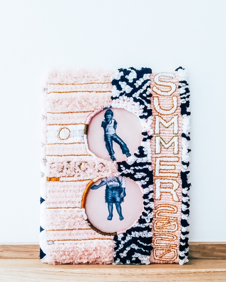
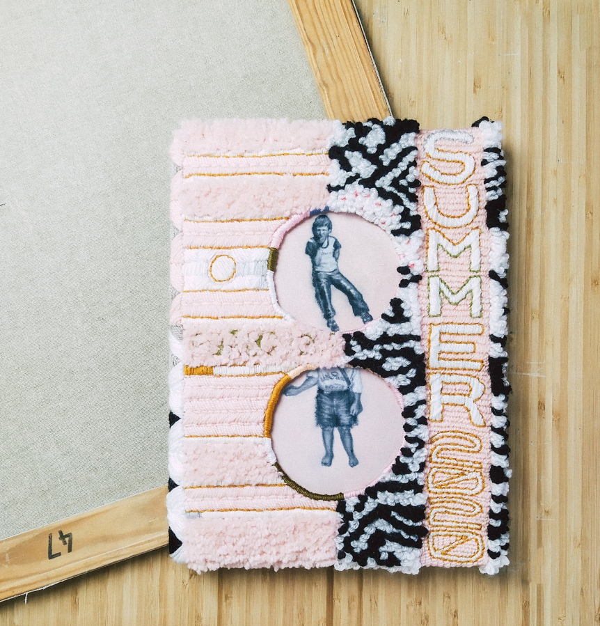
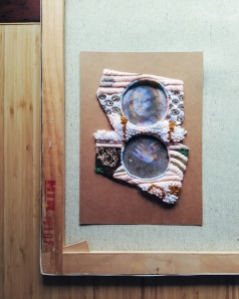
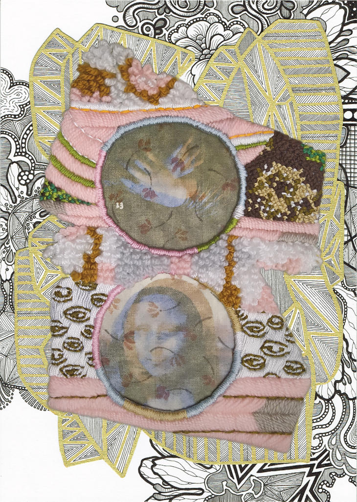
"Proximity" by Tiina Lilja (2020) embroidery and oil paint on board
“Proximity” by Tiina Lilja (2020) embroidery and oil paint on board

I’ve had some great news last Thursday: I’m finally going to be off furlough and back to work as a studio painter.  It has been a privilege to dedicate this much time for making my own art, but to be completely honest, I am really keen on returning to a form of normal in September.

Unlike my husband who has been working from home throughout and following lockdown, I have needed to set my own challenges during the Covid-19 crisis.  I would definitely say I was in a bit of a creative slump before the pandemic and the only way to move forward towards the new normal was to change the way I make art.  Focussing only on the positives, the last several months have made me more confident in exploring new ways of making visual art as well as tackling more overtly personal subject matter than ever before.  The first of these experiments, begun in early spring and finished in late July, is Proximity: a piece about my father who I haven’t been able to see since last summer.

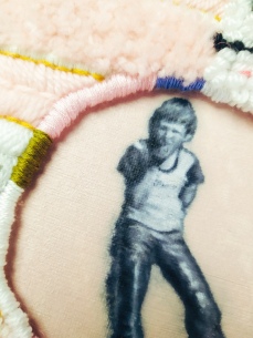
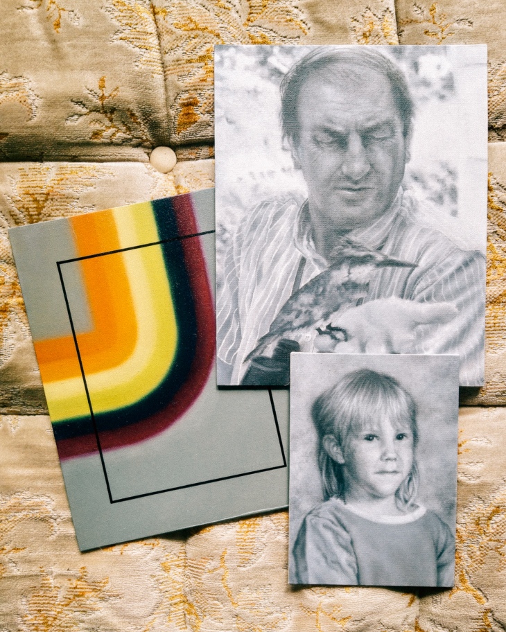
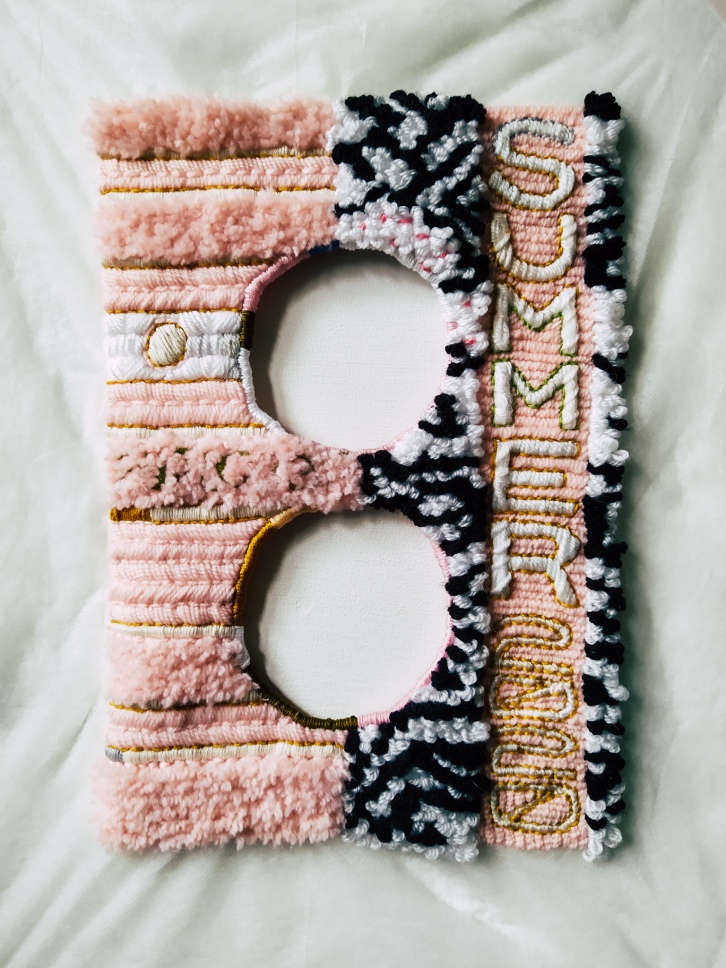
Proximity is a mixed media piece, slightly larger than an A4 sheet of paper, combining two oil painted miniatures sitting within an embroidered frame.  The portraits, one featuring a young boy around the age of 7 and the other of a slightly younger girl with her head cropped out, are those of my father and me.  In the photographs my painted portraits are based on, we are wearing the same pair of tasselled leather trousers, although by the time I had the honour of doing so, nearly 25 years ago now, they had been cut into shorts.

The reason Proximity took so long to finish was largely due to my indecisiveness.  Having finished the embroidered cover, largely using cotton thread and acrylic yarn, I simply could not choose what I wanted to paint.  Overtly Covid-centred subjects would have felt false – I am not that type of an artist and everything else seemed too mundane.  I left Finland over ten years ago now, but I have never felt this far away from home before.  Of all the things I have missed during lockdown: family, friends and my home in France… it was my dad Juha who I missed the most.  He’s a typical Finnish bloke, not the type to video chat or hang around social media and I have really cherished our long phone calls during this difficult time.

For better or for worse, Proximity is my main lockdown piece.  I have already improved on some of the ideas I first explored with this piece; others I have completely abandoned for now, but it shall always have a special place among my artworks.  I turned thirty just a week ago and the most important thing I am trying to implement, having reached this milestone, is to spend less energy on worrying about what other people think of me.  I lost quite a few followers off my Instagram when I started posting images of these types of mixed media- and textile pieces, but I’ve gained new ones since.  Life is too short to obsess over social media, and not worth living if you are just going to regret every risk and change of direction.
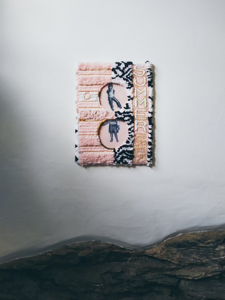
"Proximity" by Tiina Lilja (2020) embroidery and oil paint on board

So: take risks, create and don’t lose sight of the things that matter the most – that’s the new normal public service announcement from me to you.

Tiina x

Smoke and Mirrors

Hi guys, here’s a quick one – a wee social media gimmick I commandeered recently:

It’s not all just smoke and mirrors you know!

Actually, that’s exactly what it is.

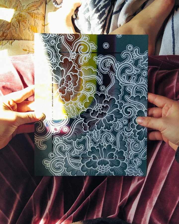
Easy trick to get an interesting background for your instagrams...

Literally, all you need is a mirror….

…and a camera, I suppose.

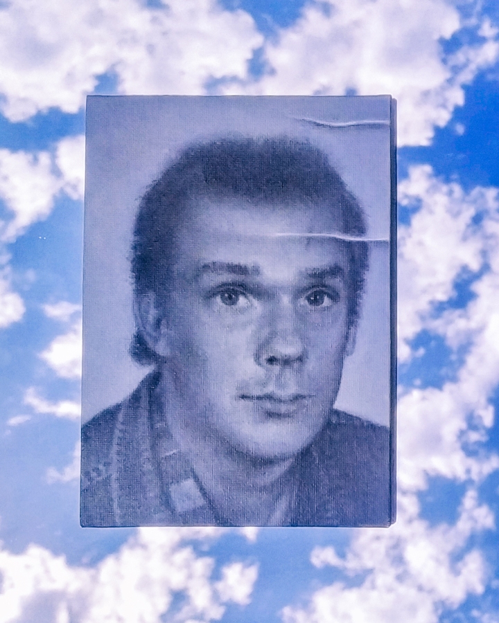
Easy mirror trick for a neat instagram background for "1986" by Tiina Lilja

Works for video or photos, but you may want to wait for pleasant weather.  Between this still and my video, the sun was up and my wee insta clip wasn’t quite as nice as the photo, but here we are.  ¯\_(ツ)_/¯  I have been on a lookout for new ways to present my work and this trick looked really nice.  Well, I’d say that, wouldn’t I, but what do you think?

I got a few blogs lined up for you in a bit, an announcement and a bit of new work, but that’s going to need to wait until I’m done celebrating my 30th birthday.

Till then, keep calm and create!

Txxx
A word with the Micromanager

Anybody else struggling with motivation lately?

Seems like this is all I talk about these days; I am not really built for the anxieties of the new normal.  Where I tend to be pretty good at setting my own goals and sticking by them, lately the uncertainty with work and life in general has really started to affect my productivity.  Add in a generous helping of self-doubt and you end up with this hard-to-shake feeling of existential dread.

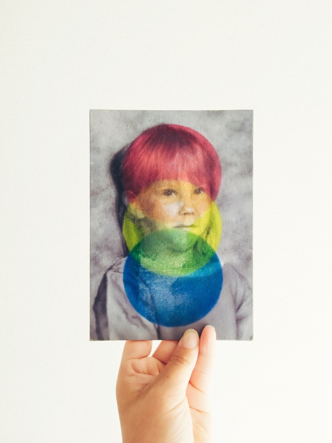
Not the best of times to revisit a finished artwork, I know, but here we are.  Remember “1997” – I wrote a blog about the meaning behind the picture some weeks back and logged it as finished on my studio inventory.  Case closed.  Yet I have not stopped thinking about the wee thing.  It is a piece that means a lot to me, being a sort of self-portrait and all, but I kept thinking it should somehow be… well, better.

This is by no means the first time I have started again: just last summer I completely repainted one of the faces in Two Brides.  It was a calculated risk that paid off, but not an easy decision to make at the time.  The materials I work with, mostly oil- and acrylic paints, are non-reversible.  They can be removed using solvents or brute force for sure, but generally speaking you cannot restore areas that are overpainted once the paint has dried.  A strict one-way system of sorts.  The reason a conservator would use specialist pigments in restorative overpainting is so that their work can be safely removed when necessary.  As an artist however, a maker of things, this is not a practical way to build artworks.

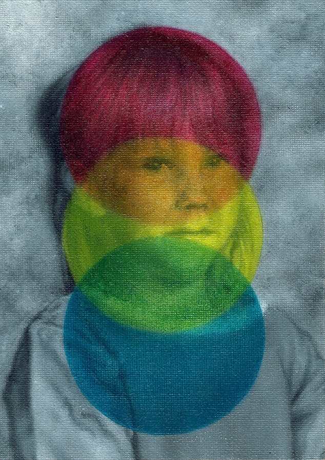
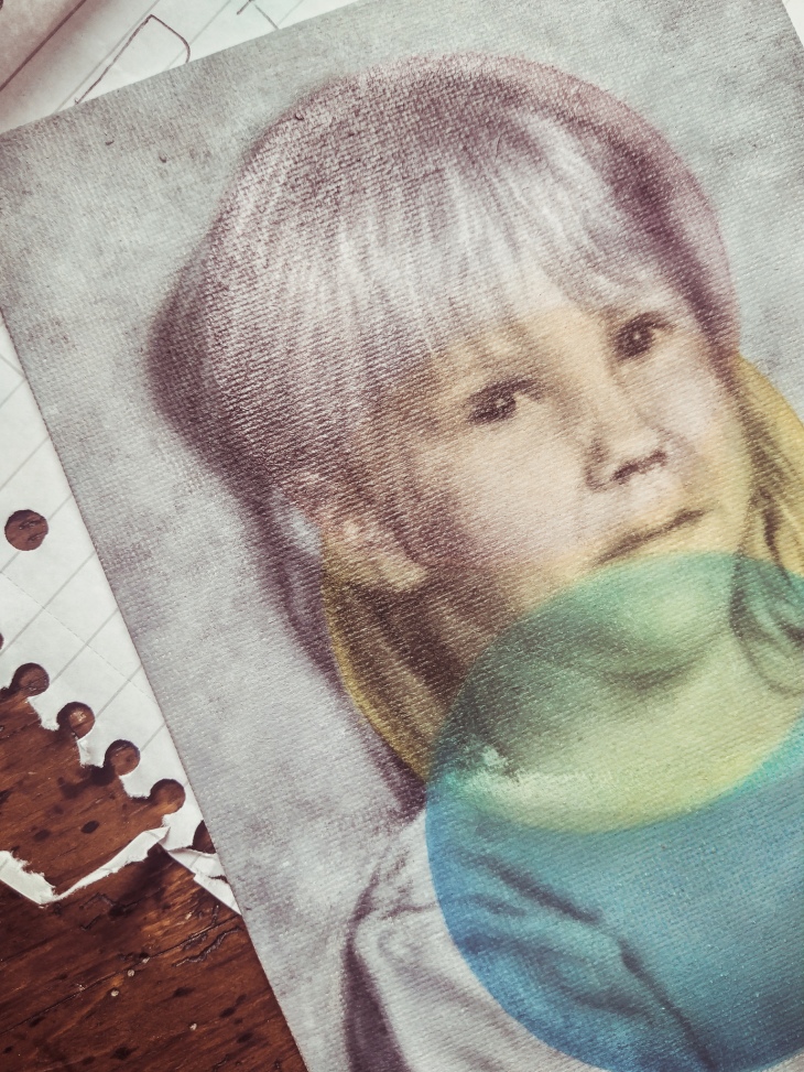
Personally, I thought the multi-coloured elements I added on top of the black and white portrait in 1997 were a bit heavy handed.  I did not want to remove this layer fully, but rather integrate it better with the portrait underneath, by making areas on the face more translucent.  I could have added more paint, or sanded down parts of the coloured top layer, but I opted out for a riskier strategy of a solvent, turpentine to be precise.  The main reason I felt this painting was not working previously, was the dull precision of its parts, making it all too uniform for my taste.  By choosing to remove some paint in this unpredictable way, I managed to re-introduce character that I felt was previously lost.

I am really pleased how it turned out, but again it was not a decision I took lightly.  At the end of the day, any artist is responsible for their own quality control.  Is this piece sign-off quality?  Could I be displeased about it simply because I feel down about most of my work just now?  Is the time used reworking this piece time/money well spent?  Question yourself before taking steps that are irreversible.  Measure twice, cut once etc.

If you need to think whether an artwork is finished, it probably is not.  Conversely, there is a fine line between sensible quality control and micromanagement.  You can set any picture (or a problem) aside and return to it when you are feeling better/more confident/re-inspired.

Or simply, ask a friend – if there’s one thing I have learned from the Covid-19 crisis it is that we’re all in this shite together.

This is probably the most famous picture in the world.

It’s been a weird few weeks so I hope you forgive me for not being desperately active on the blog lately.  But I have been busy in the studio, trying to finish up my furlough paintings and working on some new embroideries.  Even so, finding the motivation to make art has been a struggle.  I surprised myself, really, when I positively leapt on a chance to take part in the Door to Door project organised by Art Aviso.

The concept is simple: Each participating artist will be supplied with a page from Newnes’ Pictorial Knowledge 1950’s Encyclopaedia selected at random, which will form a basis of an artwork to be exhibited at Lite HAUS Galerie, Berlin in September 2021 as well as joining the active, evolving Art Aviso Door to Door virtual exhibition.  There’s still time to join in – Art Avisos Door to Door – Art in time of Covid-19 project is open to their subscribers based in UK and Europe.

I just finished submitting my artwork “This is probably the most famous picture in the world” , so how about a little “behind the scenes” tour?

Here’s how I wrote about my contribution:

If imitation really is the sincerest form of flattery, Da Vinci’s Mona Lisa is the finest portrait ever painted.  Arguably the most famous picture in the world, she has earned her place among the most copied images too, through countless reproductions in books and in print, all the way to keyrings and tea-towels emblazoned with that mysterious smile.

Her entry in the Newnes’ Pictorial Encyclopaedia can be found in Volume 7, under Great painters of all Nations- How they lived and what they achieved, on page 13.  She is iconic – and utterly untouchable.  My work is very much concerned with icons and idols, but the only way I felt I could approach the Mona Lisa, was through her numerous copies, from the tastefully informative such as the black and white illustration on my allocated leaf, to the utterly absurd.  A naughty Mona Lisa Halloween costume comes to mind as a good example of the latter sort.

With this in mind, I set out to embroider and draw around a set of photo transfers featuring digitally altered snippets of the page I was allocated.  Beyond scaling everything to fit a sheet of A4 paper, I made no sketch or a plan for the piece as I wanted it to assume its shape organically.  Like in a game of Chinese whispers, the end result is both reminiscent of its origin and removed from it.  A nuanced smile.

As said, I was well chuffed about the project briefing: maybe my page was going to be an awesome medical illustration or an obsolete graph of some sort.  What dropped in my inbox, however, was a black and white rendition of the most famous portrait ever painted: the Mona Lisa by Leonardo Da Vinci.  I was not disappointed by any means; just a little lost at first.  The Mona Lisa is not just one of the most recognisable images in the world, but also amongst the most copied.  Any retelling of this image would immediately be compared not just to the page from Newnes’ Encyclopaedia, but to the thousands of other renditions of Da Vinci’s masterpiece.

Faced with this dilemma, I decided to focus on the idea of reproduction through repetition rather than simply re-imagining this renaissance icon in 2020.  Two snippets from my allocated page, digitally altered and cropped, became the core of my piece in form of photo transfers, ironed on patterned scraps of cotton.  The rest was left to form freely around a sheet of A4 paper set out as the base for my work.  As said previously, the process best resembled a game of Chinese whispers with an excitingly unpredictable end.

Material wise, I thought it was important to stick with things I had in my studio at the time.  Although I did have to purchase a can of mount spray, I was pleased how the colour scheme of the piece was influenced by other projects I am currently working on, rather than being pre-determined through deliberate design.  I am a slave to habit and breaking out of my usual comfort zone of meticulous planning has truly been my favourite aspect of participating in this project.

If any of this floats your boat at all, pop over to the Door to Door exhibition page to see how other artists have re-interpreted their encyclopaedia pages.

“This is probably the most famous picture in the world” by Tiina Lilja for Art Aviso Door to Door - Art in time of Covid-19 project. Mixed media on paper, (2020)


Summer 2020

I can’t believe it’s almost Midsummer!  This has not really been the season by the sea I was hoping for, but at least I am lucky to be spending it safe and sound with my husband and the dog, who absolutely loves having both of his parents home with him.  In other news, my furlough continues, and with it, the exploration of different ways of making art:  this cheerful little embroidery below will make up most of my next artwork aiming to combine embroidered and painted motifs.

Embroidery in progress - Mix of different stitches

The intersection of contemporary art and traditional crafts has intrigued me for some time now: most of my life in fact, if you count in the masterpieces I was creating before I could lace up my boots properly.  In fact, one of my earliest art-making memories is about my grandmother and her sewing cards.  These colouring-meets-sewing kits tend to be a bit of a Nordic thing, but basically they are these sturdy printed cards with pre-punched holes for kids to “embroider”.  The concept is pretty straightforward: first you stitched around the outline of your colouring picture with a plastic needle, using any of the multi-coloured threads from the kit or a piece of left over yarn.  Then you were to expertly colour in the image and presented the magnum opus to your Nan, who would immediately call you a very clever little thing and perhaps reward you with a bowl of wild strawberries liberally sprinkled with talkkuna.

View this post on Instagram

Samaan aikaan toisaalla #6vuotias #ompelukuva #muumi

A post shared by Lilli (@lilli.katariina) on

I adored my Nan and I adored her sewing cards.  She spared no expense nor effort in getting me the Moomins kit, tons of nature & farming ones as well as the coveted Disney Pocahontas collection.  Eventually, I had sewn through the whole range available from the mobile shop that visited her secluded farm twice a week, so we started making our own.  This was frankly much more interesting.  Forget about the dull plastic needles for silly little children – the thick utilitarian card we used required a long, sharp adult one from my Nan’s sewing kit she kept in the drawer of her pedal Singer.  I only ever stuck myself once.  Embellishing my sewing-card self-portrait with my freshly-drawn blood remains the most avant-garde event of my art career to date.

My current piece is by no means the only time I have attempted to create combining visual art and embroidery.  During my student years in Edinburgh College of Art, some years earlier, I returned to the subject of embroidery and painting time and time again, frankly, with mixed success.  At that time, I felt a keen pressure to perform as a painter rather than pursuing any mixed media interests and it took me some time to return to carry out these experiments.  Although inspired by a very different strain of research material, my Double Exposure project, begun in late 2018, borrows heavily on the work I did with my Nan’s sewing cards back in the early 90’s.  Two of those pieces are currently on view at Envision Arts’ online exhibition Threaded II.

It is fascinating how I return to this subject matter time and time again, especially when I feel my college-aged experiments were not particularly promising.  In a way it is like an itch I need to scratch.  Now is as good of a time as any – the world has gone mad and I suddenly feel less self-conscious about my work than I have ever been.

All those years ago, each time I finished a sewing card, my Nan would pin in on the wall, adding it to a growing collection of drawings by her grandchildren at the back of her cottage, right above her radio and next a selection of framed family photos.  There was some rotation, but her favourites would remain for years, long after I stopped embroidering, probably long after I grew up and stopped visiting too.  All that yellowed card and faded thread – as far as I can remember they were the only art she ever owned.  Well, besides from those naff tea-towels printed to double up as calendars.

She died of advanced dementia nearly ten years now, my Toini-Mummu, and this one is for her.

Threaded II

I have been so busy with a project that I almost forgot some of my Double Exposure pieces are currently on show at Envision Arts online exhibition Threaded II!  This is a multimedia exhibition, curated around the idea of fibres, and all work submitted needed to consists of 25% fibres of any form.

The two pieces accepted for the show combine found imagery, drawing and embroidered motifs, with an aim to highlight how our knowledge on the personal life of an author affects the way their work is viewed.  I was compelled to create this body of work upon receiving a book of photographs called “Souvenirs” by David Hamilton.  Like a window that gets dirtier and harder to peer through with the passage of time, it is difficult to observe Hamilton’s photography in earnest without the cloud of child abuse accusations obstructing the view.  Following this line of reasoning, I began to draw with a view of obscuring, but not entirely covering the pages of Souvenirs – to physically replicate this effect on paper.  The embroidered inserts, executed using cotton and wool, are an extension of this process.

Double Exposure by Tiina Lilja (2019) mixed media on paper

You can read more about the project and its evolution at my previous blog posts Double Exposure and Double Exposure – Drawing New Narratives.

Tooting my own horn aside, I was blown away by the quality of the pieces on display.  My personal favourite being two tapestries by Jordan Holms, who was rightfully awarded an honourable mention for their contribution.

But why am I rabbiting on about it, you can view the whole exhibition at Envision Arts in June 2020.

Enjoy the show.

1997 – on Seductiveness of Nostalgia

My family, coloured pencil on paper, 1994

NHL-cards and Extreme Ghostbusters… that pretty much sums up the year 1997 for me.

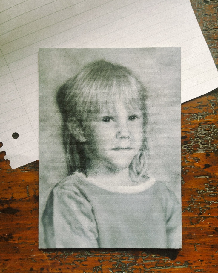
Although Nokia was already in the process of forging their mobile-millions in 1997, Finland was far from being the tech-savvy start-up capital of the world it is known as today.  In fact, most people were barely back on their feet following the early 1990’s depression and the subsequent collapse of the Finnish economy.  Between 1992 and 1997 unemployment had hovered between 12-17%, but things were looking up.  Not insignificantly, our boys took home gold at the 1995 Ice Hockey World Championship Games, hoisting the nation’s collective self-esteem to an all-time high.  On a more personal level, I started school a few days short of my seventh birthday in August of 1997, rocking a blond mullet and clothes sewn by my mother, with dreams of being an artist one day.  We were a few years short of moving out of the council flat I was born in, shopping was paid in Finnmarks, calls made on GSM and you needed to wait two weeks for your selfies to be developed and delivered to your door.

"1997" by Tiina Lilja, work in progress

Time works in strange ways during those early years of your lives.  Indian summers and white Christmases; the full Monty.  Most people remember but an idealised version of their formative years.  I certainly wasn’t aware of the archaic economic and socio-political structures unravelling around me.  For a child such as myself growing up in a sleepy regional town in the South West of Finland, the winds of change blowing through my small nation were easily drowned out by the gentle sway of its ancient forests.  Kids are like that I suppose, adaptable.  My dad was home a lot when I was small and I loved it.  It took me years to figure out he’d been on furlough or had lost yet again another job alongside tens of thousands of young men like him.  The average unemployment figure might have been around 15% in 1994, but for builders like my dad, it was over 36%.

So much for the good old days.

Why is it then that we turn to nostalgia when times are hard?  Is it really a coincidence that Christian Dior struck gold with his “New Look” featuring ultra-feminine, conservative looks reminiscent of La Belle Époque in 1947?  Just ask George Taylor, he introduced us to the Hemline Index as far back as in 1926.  For the lockdown season of 2020, whether you are shopping at Primani or Prada, there’s a new look in town:  Long floral dresses and puff sleeves.  Comfortingly feminine, non-threatening – nostalgic.  And it’s not just the fashion you need to look out for.  Retro has been big news in graphic design for some time now, but when the big multinationals like Unilever or Nestle’ whip out their heritage packaging, buckle up Bucky you’re in for a ride.  A sure way to spot the economy is in the toilet is knowing you are being tempted to buy biscuits by enrobing them in the warm fuzzy happiness of nostalgia.

"1997" by Tiina Lilja, 2020, oil on board - work in progress
“1997” by Tiina Lilja, 2020, oil on board – work in progress

I am not saying nostalgia is inherently bad for you.  It is, however, incredibly seductive to remember only an idealised, simpler version of the past.  Jamie Windsor talks about the problems of nostalgia in much more elegant terms in his video essay simply titled “Avoiding Nostalgia”.  This yearning to recall an ideal past void of modern evils is a powerful marketing tool and harnessed so sell us things as well as influence our political decisions.  “Make America Great Again”, remember.

The art I have been making lately is riddled with nostalgia, but I did not set out to paint nostalgic imagery just to introduce you to my mullet, circa 1997.  People do not yearn for simpler, happier times in a vacuum.  I am talking about the mother of all nostalgia, the cardinal reason why we so crave that idealised past: fear.  Fear of uncertainty, fear of change and fear for what the future will hold.  He has been my constant companion in the studio for these past few months.

"1997" by Tiina Lilja (2020) oil on board
“1997” by Tiina Lilja (2020) oil on board

No filter more powerful is yet invented as that of the perspective of a child.  Somewhere between the Pogs and Dr. Bombay, I do remember the recession of my childhood: from the bread-ques (the Finnish expression for foodbanks) hand-me-downs and the evictions.  I suppose those were the things my parents would have called the new normal at the time.  It must have been a balancing act of royal proportions, but they pulled it off.  Out of many wants and withouts, we always had a roof above us, food and each other.  Although it took me years to stop feeling inferior in the company of those more affluent, I started school in the August of 1997 confident in my ability to achieve anything my heart may desire and largely unafraid.  A sparkling new cog eager to take their place in a machine being built on top of the old.  The fear of uncertainty, rejection and loss crept in much later, alongside the responsibilities of an adult and a need to find my place in this world.

As a painter, I need to make sense of my surroundings through the images I create.  If ever there was a constant I wish to cling on to when our world has turned upside down, it is art.  And I hope the art I am making gives even a fraction of the solace it has awarded me, to you and others stuck in the twilight zone of the new normal.

Keep calm and create,

Tx

Come Draw With Me

Real talk: the lockdown is starting to get to me.

In other words, I find myself getting anxious about the silliest things and constantly second guessing the value of my work.

During these times of increased levels of existential dread, I put on Bob Ross and binge the Joy of Painting or find other suitably relaxing content on You Tube.  Others meditate or run marathons, but i prefer to watch something mindlessly satisfying on a small screen while I sketch.

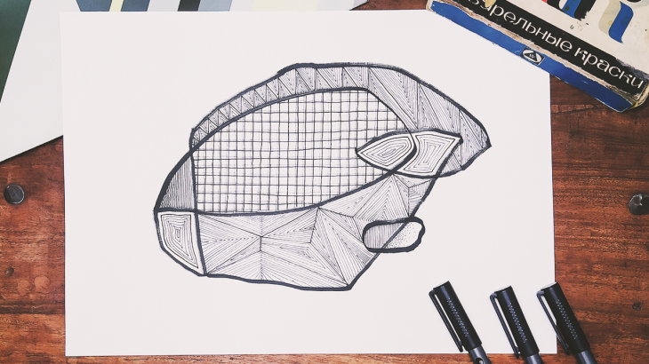
geometric illustration

On the off-chance you too might be looking for absolutely non-Covid-19 related content to calm yourself down, I decided to create some strangely satisfying doodling-videos of my own.

So, follow my process of sketching out a geometric line drawing or a bohemian gypsy-rose.  Grab a pen and paper of your own and draw with me, or simply let the hypnotic line-work lull you to a better place where the pubs are open and your mother-in-law is allowed to visit.*  Either way, hope you enjoy my humble contribution to the slow television corner of the internet.

*Or maybe not, depending on the mother in law – mine is dead nice, though.

As Bob would say,

“Happy painting.” 

Tx

Pumpuli Enkeli

Can I withhold pay if my studio assistant refuses to social-distance himself?

My studio assistance refuses to social distance himself.

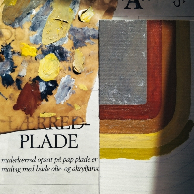
Greetings from the atelier floor – I’ve got something to show to you and I swear it is more than just adorable photos of my dog.  The rainbow-hued mixed media piece that cropped up on this blog last week is finally finished.  Now named “Pumpuli Enkeli”, it started out as a simple test in blending, on a slightly defective canvas panel.  It is quite rare that I have time to experiment beyond doodling on the pages of my sketchbook, so this has been a real treat.

Long story short: I wanted to see if it would be possible to use acrylic paint markers on top of an oil painting.  Usually you’d expect some rejection, but it has turned out much better than first predicted.  I used spray-on picture varnish as a blocker between the oil-painted basecoat before adding the line work using acrylic paint markers.  A few days later, further two coats of picture varnish were added to protect the finished surface and give this artwork an even sheen.

Only time will tell how it will age, but so far so good.

colourful calico painting by Tiina Lilja

I have been drawing a lot of floral patterns lately, inspired by one of my favourite books: Owen Jones’ the Grammar of Ornament as well as his the Grammar of Chinese Ornament.  Yet it wasn’t Mr. Jones who turned me into a connoisseur of printed cottons.  I grew up in a historic textile town of Forssa, in the South West of Finland, so you could say the love of pattern is in my blood.  The name Pumpuli Enkeli translates as the Cotton Angel – a nickname of the factory girls of Forssa who worked in the Finlayson textile mills.  This is the official version anyway, sanitised by the passage of time.  Some old beards who worked down at the mill as lads in the beginning of the 20th century, however, recalled a cruder alternative in a documentary I saw years ago: Cotton C*nts.

Fair enough.

Angels or not, this painting is my tribute to those largely nameless girls and women who shaped Forssa into The City of Colourful Cloth.

The history of my hometown has inspired me to a great extent and I cannot deny the influence Finnish design has had on my work.  There are many artists and designers I feel indebted to, with special thanks given to Aini Vaari, who drew patterns for Finlayson in the 1950’s and 60’s.  My painting “1958”, featuring her Coronna-design as a background motif, continues to be one of my own favourites.

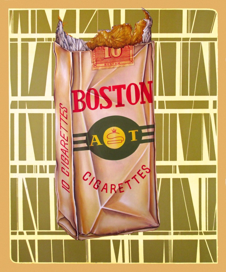
At the time I was obsessed about mid-century Americana in Scandinavian graphic design, such as the Boston cigarettes pack featured in my painting.  It is modelled on a real pack of fags given to me by my builder dad, who had found it under a floor on one of his job sites.  Either left behind by accident in the late 50’s or placed there to amuse renovators of the future, the dinky cigarette case was all crinkled up, but as vibrant in colour as on the day it was printed.

"1958"

Oddly enough, the other paintings I am currently working on, too, remind me of home.  Most of these pocket sized portraits feature my immediate family back in Finland.  Although I have lived overseas for ten years and a bit, it is this pandemic that makes me feel light years away from them.  Tracing the likeness of my dad or my wee sister makes me feel that little bit closer to them when the world seems to be going down the toilet.

But enough of that negativity already.  I should be back at my 9-5 in a few weeks’ time, fingers crossed, and in the meantime I have a studio full of paintings to finish.

So happy painting!

Tx

Work in Progress

I don’t know about you, but I am really struggling to get anything finished these days.

So, in the spirit of keeping calm and carrying on, I thought I’d give you a few work-in progress-snaps.  Y’know, in case you too are browsing the underbelly of internet rather than getting back to work.  I would know… after all, I am writing this to actively avoid getting any painting done.

Lots of little paintings needing to be finished in my studio

As you can see, my little family of portraits is steadily growing and I do promise to get on with it all.

Tomorrow, maybe.

In general, I do find working on multiple paintings pretty useful.  Mainly, as it stops me from getting bored of my own work.  Also, when using oil paints, this will give you something dry enough to paint on each day.  That is the theory anyway.  Right now I have a studio full of little paintings, like a closet full of clothes and nothing to wear.

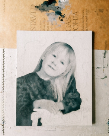
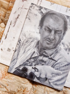
The latest additions are my wee sister (left) and me (right), captured around 1996-1997 or so, and my husband’s dad (centre).  I never got to meet John, which makes rendering a likeness quite difficult, but we are getting there.  Painting a portrait from a photograph alone can be a bit tricky, but luckily I have my hubby to guide me through it.  As silly as it sounds, sometimes you can paint the most perfect copy of a photograph, yet as a portrait it looks nothing like the person photographed.  This wasn’t a problem when I was painting my dad, for example, as I know his features better than my own.  I loved being able to spot any rogue brush strokes immediately, but here I am not quite so sure of myself.

We’ll just going to have to wait and see how this portrait develops.

The other thing I’ve been working on is the vibrant rainbow swirl pictured above.  It started out as a colour test for another project, really, but could mature into a piece of its own.  I am currently waiting for the paint to dry on this one so I could start adding new elements on top of the oil painted base-layer.

So stay tuned – how long can it take to find inspiration locked in a small cottage in the middle of a pandemic?  Right!?

Oh, and allow me to toot my own horn a bit.  If you fancy more of these work in progress type of posts, head over to my Instagram;  you’ll get your fix there.

Cheerio.

Tx